
Where to Place Text on a Video Cover for Mobile Feeds
Place video cover text for mobile readability with clear hierarchy, crop-safe spacing, platform-specific canvases, and a practical phone-preview checklist.
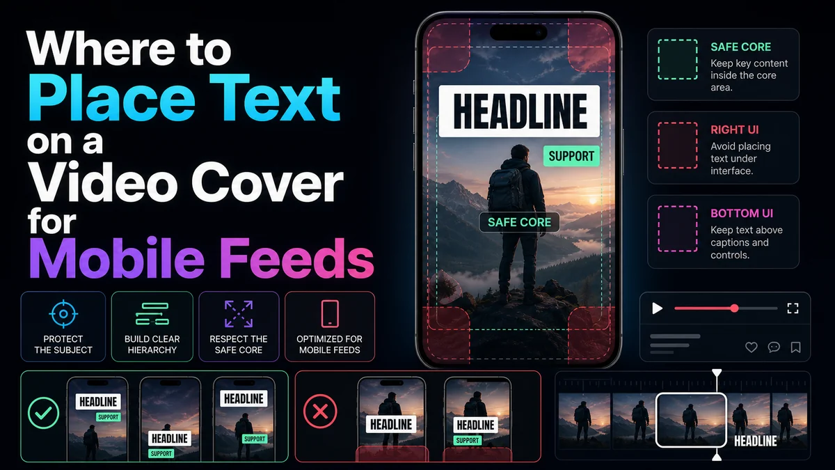
Good video cover text placement starts inside a compact, center-biased area, with generous clearance from the outer edges and any interface controls visible in the current posting preview. Keep the main phrase visually dominant, separate it from the face or product, and avoid depending on a single permanent “safe-zone” template. YouTube thumbnails, TikTok cover frames, and Instagram Reels covers use different ratios and display surfaces, so the reliable method is to compose per destination and test at real phone size.
Key Takeaways
- Place essential text near the visual center, then offset it only when the subject and current UI leave a clearly protected area.
- Use one dominant message; secondary text should never compete with it at thumbnail size.
- Treat official dimensions as fixed guidance and text-safe areas as practical, preview-dependent advice.
- Recompose horizontal and vertical covers separately instead of shrinking or rotating one layout.
- Test the exported image in the current mobile posting preview, profile view, and feed card where available.
The safest starting layout
For a mobile-first vertical cover, imagine three layers:
- Central message core: the subject and essential headline occupy the middle portion of the canvas.
- Flexible buffer: empty or nonessential background surrounds that core and absorbs modest crops.
- Interface-risk perimeter: the outer edges remain free of irreplaceable words, eyes, logos, and evidence.
This is a composition model, not a platform-issued pixel template. Exact controls can move with device dimensions, app updates, captions, account features, and viewing context. The model works because it creates tolerance without pretending every platform uses the same overlay.
Fixed specifications vs placement advice
Keep technical facts and design heuristics in separate columns.
| DestinationFixed, officially published guidancePractical text-placement advice | ||
| YouTube standard video | 3840 × 2160 recommended; 16:9; minimum width 640 | Use a large text block with strong contrast; keep it clear of the focal subject and readable in a small recommendation card |
| YouTube Short | 2160 × 3840; 9:16 | Stack text in a compact vertical hierarchy and preserve edge tolerance because vertical previews can vary by surface |
| TikTok organic post | Official consumer help documents selecting a cover frame from the video; no separate pixel export size is stated there | Prepare the intended words inside the vertical video frame and check their profile/post appearance in the current app |
| TikTok auction in-feed ad | Vertical 9:16 recommended, at least 540 × 960 for video creative | Apply the current ad-preview safe-zone overlays for ad work; do not transfer this as an organic cover-file rule |
| Instagram Reel | Cover photo recommended at 420 × 654, or 1:1.55 | Keep essential text and the subject in a central composition that still makes sense under alternate presentation crops |
The right column is intentionally nonnumeric. None of the cited consumer platform pages provides one universal cross-surface pixel boundary for cover text. A fixed diagram can be a helpful internal template, but only the live preview can validate the current interface.
Build a readable text hierarchy
Primary line
The primary line carries the cover’s one essential idea. It should be the first text a viewer notices and should remain readable when the cover is reduced. Use plain words, a strong weight, and a line break that preserves meaning.
Do not copy the entire video title by default. A cover can supply the outcome, tension, category, or key question while the title provides context. YouTube’s official creator tips recommend succinct, accurate titles and readable thumbnail text; the larger principle is that image and title should help the viewer understand what the video contains.
Secondary line
Use a secondary line only when it adds necessary context, such as a part number, format, or comparison label. It should be clearly smaller and less visually dominant than the primary line. If it disappears at phone size without harming comprehension, the hierarchy is working. If losing it changes the meaning, the primary line is not doing enough.
Decorative labels
Treat badges, category tags, arrows, icons, and brand marks as optional. They should not form a third competing headline. Remove them if they reduce the space available for the main idea or create visual noise.
Choose the text side from the subject, not a template
The familiar “text left, face right” pattern is useful when the source image supports it, but it is not a rule.
Place text where:
- the background has relatively even tone or can support a subtle backing shape;
- the text does not cover eyes, hands, product details, or the visible result;
- the line can remain large without touching the edge;
- the reading order moves naturally from subject to headline or headline to subject;
- the arrangement survives the destination crop.
If neither side works, use a top-to-bottom stack, a controlled gradient behind the text, a shorter phrase, or another source frame. Do not squeeze the headline into leftover space.
Platform-specific placement patterns
YouTube standard thumbnails: horizontal balance
At 16:9, divide the frame into a focal area and a message area. The subject can occupy one side while text uses the other, or the subject can sit centrally with a short headline above or beside it. Keep the main line visually large because thumbnails appear at different sizes across devices.
YouTube’s official guidance says thumbnails show differently across devices and advises creators to use a large image and avoid overly complex design. Apply that guidance by limiting competing elements and checking the image as a small card.
YouTube Shorts: vertical stack
YouTube currently recommends a 9:16 thumbnail for Shorts. In a tall frame, place the subject and headline as a compact stack rather than extending a long sentence from edge to edge. Leave breathing room above and below the core.
YouTube also warns that vertical videos with 16:9 custom thumbnails may receive an auto-generated 4:5 image on some mobile discovery surfaces. That makes it especially important to choose a source moment that remains understandable even when the custom layout is not the only preview shown.
TikTok: design the selectable frame
TikTok’s documented organic workflow uses Select cover to choose a frame from the post. If the intended cover text is part of the video, place it in a clean hold frame that can be located in the picker. Keep it away from the outer edge and from areas occupied by controls in the current preview.
Do not rely on a third-party “exact TikTok cover safe zone” as permanent truth. Interface overlays and profile presentation can change. Select the frame, inspect the preview, and return to the edit if the text is hidden or cramped.
Instagram Reels: plan for the cover ratio and alternate views
Instagram recommends 420 × 654, or 1:1.55, for Reels cover photos. Build the cover on that canvas, then preserve a smaller central core for the headline and subject. The official creation flow allows choosing a frame or adding an image, so compare both options when the source frame has poor text space.
The cover may appear beside captions, navigation, or profile elements in different contexts. Place decorative content toward the perimeter, but keep irreplaceable words and visual evidence closer to the center.
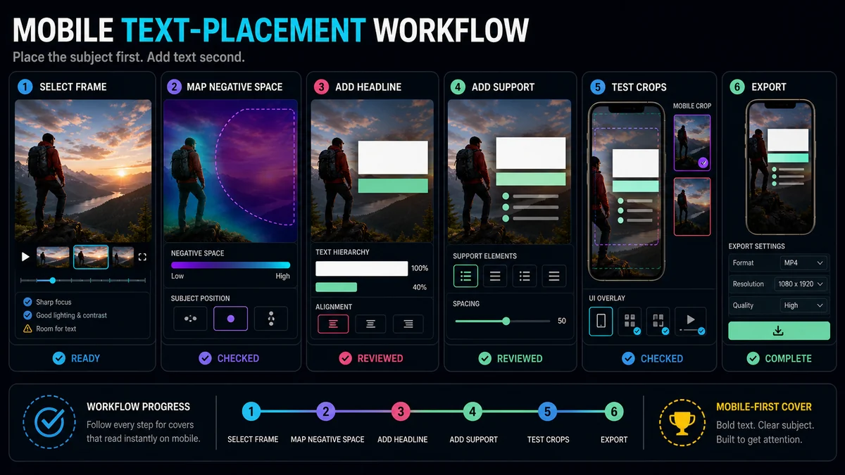
A repeatable mobile text-placement workflow
Step 1: Write the shortest complete message
Draft the full idea, then remove words already supplied by the video title or obvious image content. Preserve accuracy. A short but vague phrase is not better than a slightly longer line that sets the right expectation.
Step 2: Choose a frame with negative space
Look for a frame where the subject does not occupy every corner. If the strongest moment is busy, examine adjacent frames. A small timing shift can create clearer separation and cleaner text space without changing the meaning.
Step 3: Set the destination canvas
Use the current official dimensions when they are published. For TikTok organic posts, prepare the vertical source and use the platform’s cover selector rather than inventing a fixed standalone-cover specification.
Step 4: Place the subject first
Crop and position the subject before adding type. Protect the eyes, hands, product, result, or evidence that makes the frame meaningful. Text should occupy genuine negative space, not cover the reason the frame was chosen.
Step 5: Add one dominant text block
Use a readable weight and high contrast. Keep line spacing tight enough to form one visual unit but open enough that letters do not merge at small size. If the background varies, use a restrained gradient, outline, shadow, or solid backing shape rather than multiple decorative effects.
Step 6: Shrink the preview
Review the asset at roughly the visual size of a feed card on a phone. Do not zoom in to decipher it. Ask three questions:
- What do I read first?
- What is the video about?
- Is any word competing with the subject or UI?
If the answers are unclear, simplify the line, enlarge the primary words, or remove secondary elements.
Step 7: Run the crop-and-overlay check
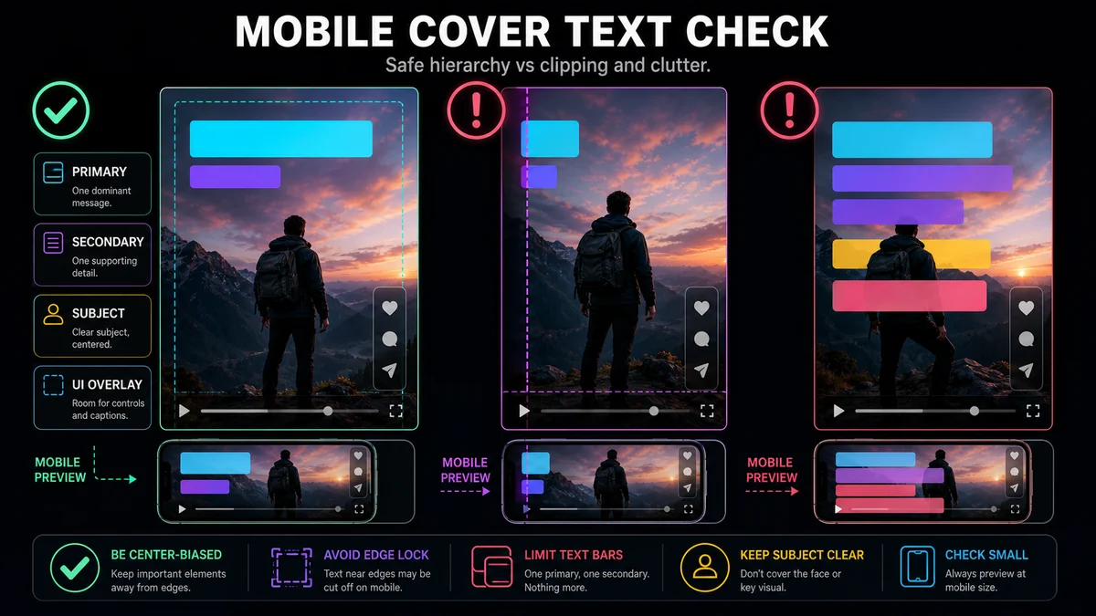
Use the current platform preview and inspect every available surface. A general-purpose checklist is more reliable than an unverified pixel rectangle:
- No essential word touches the outer edge.
- No headline covers eyes, hands, product details, or visible evidence.
- The primary line remains readable at phone size.
- Secondary text is clearly subordinate.
- The center crop still communicates the topic.
- Right-side and lower interface areas do not obscure key content in the current preview.
- Horizontal and vertical versions were composed independently.
- The cover accurately represents the video.
Common mobile text-placement failures
Long sentences in small type
Reducing font size to preserve every word usually destroys mobile readability. Rewrite the message or let the title carry the detail.
Text locked to the canvas edge
Edge-aligned text can feel modern at full size but leaves no tolerance for crops or rounded containers. Add breathing room and test a tighter preview.
Equal weight for every element
When headline, subtitle, badge, logo, and arrow are all loud, none leads. Choose one primary line and make every other element quieter or remove it.
Automatic center placement over a face
Center-biased does not mean “put text directly in the middle.” The core should contain the subject and message together, with text placed in available negative space.
One layout for every language
Localized text can expand or wrap differently. Preserve the hierarchy and safe spacing, but adjust line breaks, type size, and placement for each language rather than shrinking all translations to fit the English box.
Lay out mobile-ready covers with Recapo
Recapo’s Cover Maker supports images and video frames, and its current official page describes keyframe browsing, title-layout templates, and platform-oriented sizes. Start with a frame that has clear negative space, apply a simple text hierarchy, and create destination-specific variants.
After export, verify the asset in the current YouTube, TikTok, or Instagram publishing preview. The platform view—not an editor-only overlay—is the final authority on crop and interface clearance.
Frequently Asked Questions
What is the safest place for text on a vertical video cover?
Begin in a center-biased area with generous clearance around the edges, then place the text beside or above the subject where the background supports it. Confirm the final position in the current platform preview.
Should text always go on the left side?
No. The subject, negative space, reading order, and interface preview should determine the side. Left-side text is a pattern, not a universal rule.
Is there one safe-zone template for TikTok and Instagram Reels?
No single fixed template is guaranteed across both apps, devices, and surfaces. Use a compact central message area, keep essential content away from edges, and inspect each platform separately.
How much text should a cover contain?
Use the shortest accurate phrase that adds information the image and video title do not already provide. If the line becomes unreadable at phone size, shorten it, improve the line break, or remove secondary copy.
Do I need separate horizontal and vertical text layouts?
Usually. A horizontal YouTube thumbnail and a vertical Shorts, TikTok, or Reels cover distribute space differently. Recompose the hierarchy rather than cropping one finished design into the other shape.
References and Official Sources
- Recapo Cover Maker
- YouTube Help: Add custom thumbnails on YouTube
- YouTube Help: Thumbnail and title tips
- TikTok Support: Editing, posting, and deleting
- TikTok for Business: TikTok Auction In-Feed Ads specifications
- Instagram Help Center: Reel size and aspect ratios
- Instagram Help Center: Record a reel on Instagram
Related Recapo Guides
- Video Cover vs Thumbnail: What’s the Difference?
- Video Cover Size Guide for YouTube, TikTok, Instagram, and Reels
- How to Choose the Best Frame for a Video Cover