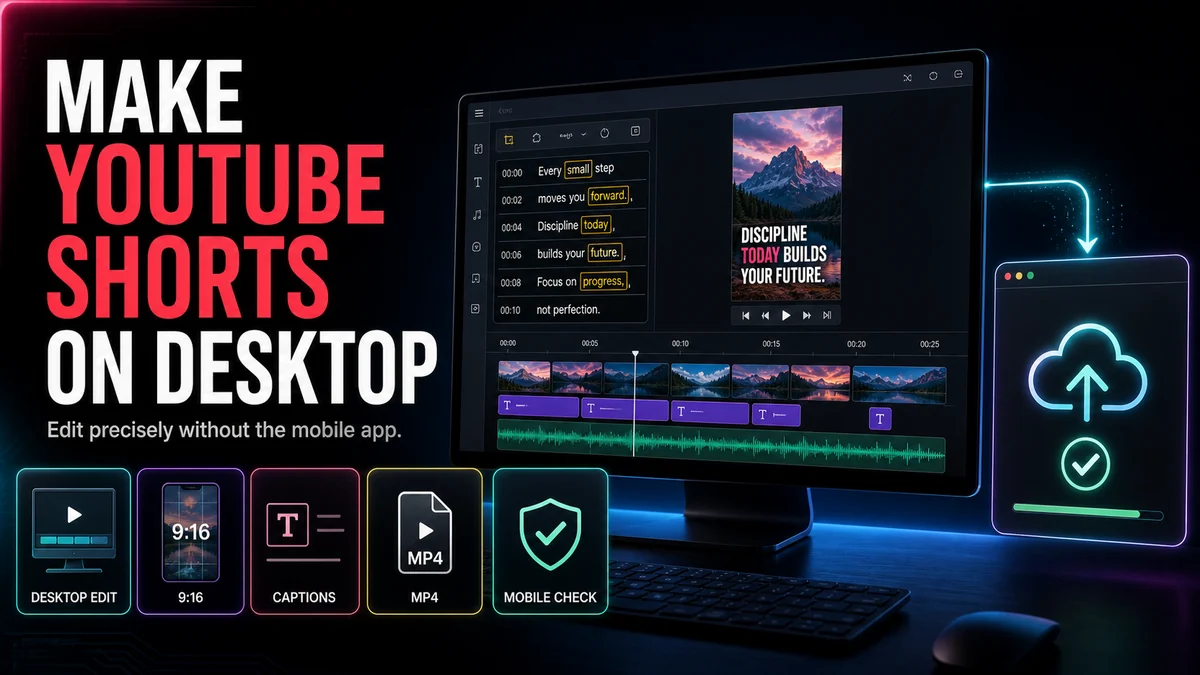
YouTube Shorts Safe Zone Guide: Keep Text and Captions Visible
Use a practical YouTube Shorts safe-zone workflow to keep captions, titles, faces, and calls to action clear of interface overlays.
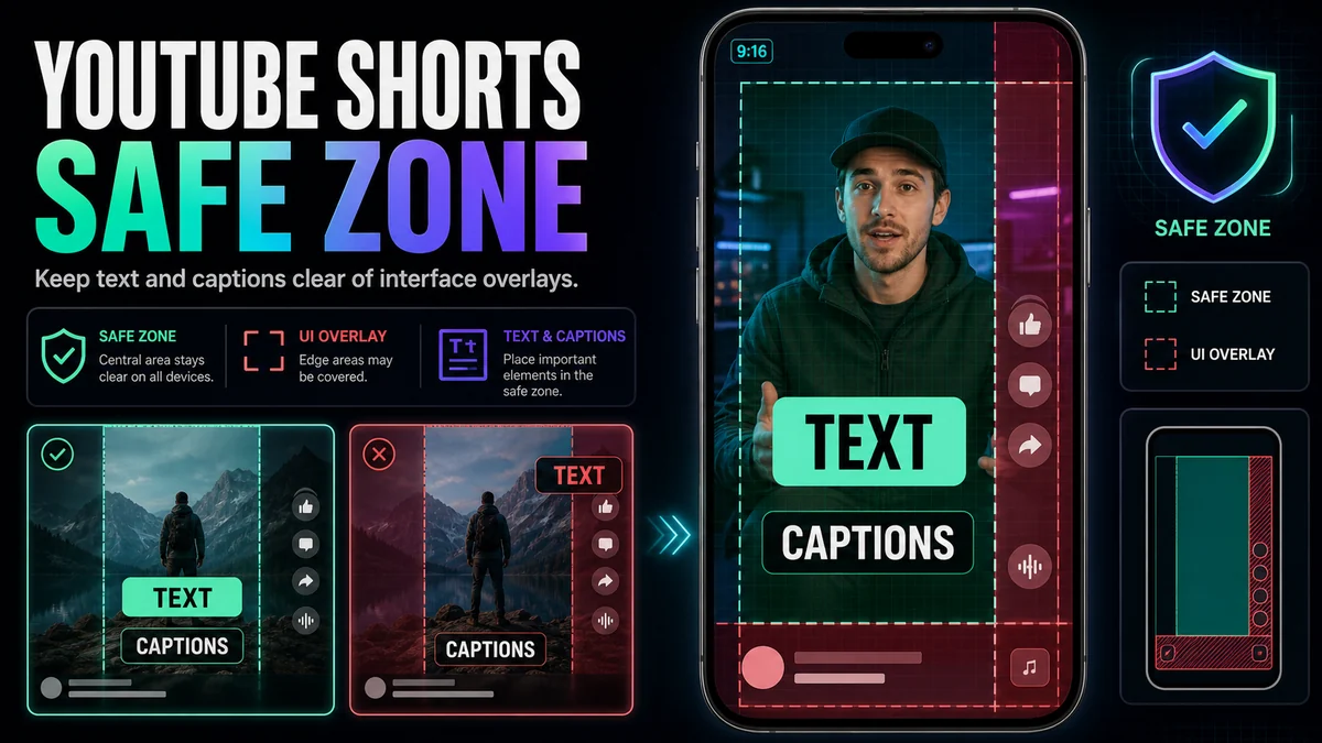
A practical YouTube Shorts safe zone is the central area where essential text, captions, faces, and products remain readable after the Shorts interface appears. Keep critical content away from the bottom metadata region, the right-side action controls, and the extreme edges; then verify the actual upload on a phone. Do not rely on a single permanent pixel template, because overlays can vary by device, interface state, and future YouTube updates.
The safest editing habit is to treat the visible frame as layers: your video sits underneath, while navigation, channel information, descriptions, and action buttons may sit above it. A clean 9:16 export can still fail if the hook, caption, or product is placed where the interface competes with it.
Key Takeaways
- Protect the center first; treat the lower and right edges as high-risk overlay areas.
- Keep essential meaning inside the safe zone, not just decorative elements.
- Use short caption groups and test both the tallest and widest lines.
- Preview on a real phone with the interface visible; an editor-only preview is not enough.
- Save an editable master so placement can be adjusted when YouTube changes its UI.
What “Safe Zone” Means for YouTube Shorts
A safe zone is an editorial working area, not an official guarantee that a fixed rectangle will remain unobstructed forever. YouTube’s public Help documentation explains Shorts eligibility and editing tools, but it does not provide one universal pixel-safe-zone specification for every device and interface state.
That distinction matters. A screenshot-based template can be useful for an initial layout, yet it may not match a different phone, accessibility setting, caption state, expanded description, or later app update. Use exclusion zones to guide composition, then use an actual upload to validate it.
Map the Overlay Risks Before You Design
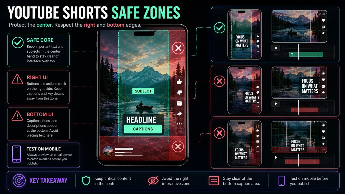
Think about the frame in four regions:
| Frame regionTypical riskWhat belongs there | ||
| Central band | Lowest obstruction risk | Main face, product, demonstration, core caption |
| Right edge | Action controls may stack here | Background or nonessential visual detail |
| Bottom area | Channel, description, audio, and progress elements may compete | Avoid primary captions and calls to action |
| Top and outer edges | Device crop and interface variation | Background, breathing room, nonessential decoration |
This is a risk map rather than a promise about exact controls. The interface you see at upload time is the final authority.
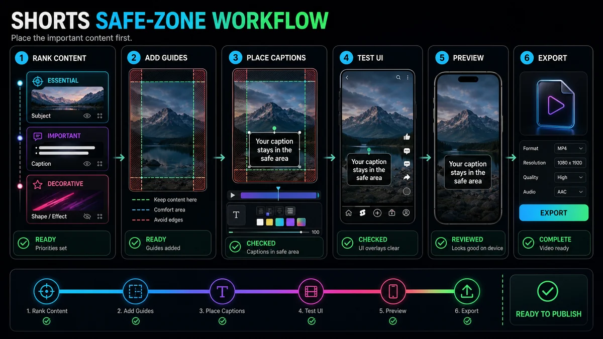
Step 1: Decide What Must Never Be Covered
List the elements a viewer needs to understand the Short. Usually that means the speaker’s face, the object being demonstrated, a result, captions, and one call to action. Secondary decorations, background textures, and visual accents do not need the same protection.
Rank each element:
- Essential: Losing it breaks the message.
- Supporting: It improves understanding but can be simplified.
- Decorative: It can sit near an edge or disappear without harm.
Place essential elements first. This prevents a common failure: designing an attractive layout and then forcing captions into whatever space remains.
Step 2: Establish a Conservative Central Band
Create guide layers in the vertical project and mark the bottom and right areas as caution zones. Keep the main subject and text in a central band with generous breathing room. Do not let a face, product label, or caption touch the guide simply because it is technically inside the frame.
The band does not need to be perfectly symmetrical. A talking head may sit slightly left to leave room for captions, while a product demonstration may need the central lower area for hands. What matters is that important content stays away from likely UI competition.
Step 3: Place Captions for Reading, Not Decoration
Captions should follow speech and remain easy to scan. Use short phrase groups, clear line breaks, sufficient contrast, and a consistent anchor point. Test the longest caption in the video—not only the short sample shown in a style preview.
Avoid these patterns:
- Captions hugging the bottom edge.
- Long lines extending into the right-side controls.
- Word-by-word animation that moves essential text around the frame.
- Low-contrast text placed over changing footage without a backing treatment.
- A caption block covering the speaker’s mouth, hands, or demonstrated object.
YouTube’s Shorts editor includes timeline controls for deciding when text appears. Whether text is added in YouTube or burned into the video, review timing and placement together: a perfectly positioned caption is still unhelpful if it appears too late.
Step 4: Separate Captions, Headline, and Call to Action
Do not stack every text element in the same safe area. Give each layer a job:
- Opening headline: Establishes the question or promise, then leaves.
- Captions: Follow the spoken content in a stable reading position.
- Call to action: Appears only when relevant and avoids covering the result.
- Labels: Identify a product, speaker, or step only when needed.
When the opening headline remains on screen too long, it competes with captions. When the call to action occupies the entire bottom, it may collide with platform metadata. Sequence the layers instead of displaying all of them at once.
Step 5: Protect Faces, Hands, and Screen Recordings
Safe zones apply to visuals as well as text. Keep faces away from interface controls, especially when a reaction is the point. In demonstrations, preserve the hands and object together. In screen recordings, crop to the active control and enlarge it enough to read on a phone.
If the source is horizontal, a simple center crop may push one speaker or a critical interface panel into a high-risk area. Reframe the shot, switch between compositions, or use a stacked layout. The Recapo YouTube Shorts Maker can create an adjustable 9:16 crop from local footage or a source link; the safe-zone review should happen after that first crop.
Step 6: Check a Cover Separately from the Video Frame
A cover and an in-feed frame do different jobs. A cover may be shown in different contexts and crops, while the video frame must survive playback overlays. Do not assume one text placement works for both.
Use the Recapo Cover Maker to work from a frame and test a bold title layout at thumbnail size. Keep the cover’s main face and action clear of the text block, and export platform-specific variants when needed. Then return to the vertical video and review its own safe areas independently.
Step 7: Test the Real Viewing Experience
An editor preview is a design aid. A private or unlisted test upload is a stronger check because it shows the actual YouTube presentation without making the video broadly available. YouTube’s upload tips explicitly suggest using privacy settings for a test Short.
Run this review on at least one representative phone:
- The first headline is fully visible with the Shorts interface present.
- The longest caption does not collide with controls or metadata.
- The subject’s face, mouth, and hands remain unobstructed.
- The demonstrated product or screen control is readable.
- The call to action appears only after the viewer sees the result.
- Text remains readable on bright and dark frames.
- The opening and ending still work when interface elements are visible.
- The editable project retains guides for future revisions.
If you see a collision, move the layer and test again. Do not solve every conflict by shrinking text; smaller type can create a different accessibility and readability problem.
A Decision Guide for Common Layouts
Talking Head with Captions
Keep the face in the upper or middle central area and place captions below or beside it without entering the bottom risk region. If the speaker gestures, leave room for hands.
Interview with Two Speakers
Use speaker switching or a vertical split. Avoid placing one person behind the right-side controls. Test name labels separately from captions.
Screen Tutorial
Crop to the active interface area, use a pointer or highlight, and move captions away from the control being demonstrated. A full desktop squeezed into 9:16 is usually too small to understand.
Product Demonstration
Protect the product and hands as one composition. Place captions where they do not cover the result. If the object moves, reframe deliberately rather than letting it drift into an overlay zone.
Quote or Text-Led Short
Keep the quote compact and centered with generous margins. Avoid placing the attribution or call to action at the extreme bottom.
Common Safe-Zone Mistakes
Copying a Pixel Template Without Testing
Templates are snapshots of one interface state. Use them as guides, then validate the real upload.
Placing Captions Last
If no room remains, captions end up covering the subject or sitting under controls. Reserve caption space during composition.
Shrinking Everything
Content can be technically unobstructed but still unreadable. Reframe, shorten, or sequence information instead of reducing every element.
Ignoring the Longest Line
A two-word sample may fit while a real caption crosses into the right edge. Test worst-case lines before export.
Forgetting That UI Changes
Keep an editable master and recheck the interface before a high-priority campaign or batch export.
Frequently Asked Questions
What is the exact YouTube Shorts safe-zone size?
YouTube does not publish one universal pixel rectangle that is guaranteed across all devices and interface states. Use conservative central placement and validate a private or unlisted test upload.
Where should captions go on a YouTube Short?
Use a stable central position that stays clear of the bottom metadata area and right-side controls. The best vertical position also depends on where the face, hands, and product appear.
Can I use the same safe-zone template for every platform?
No template is guaranteed across platforms. Each app uses different overlays and display contexts, so check the final version in every destination.
Should text be burned into the video or added in YouTube?
Burned-in text gives fixed visual placement, while YouTube caption tracks can be turned on or off and support viewer control. Many workflows use designed on-screen text plus an accurate platform caption track.
How often should I recheck my template?
Recheck whenever the interface changes, when you adopt a new layout, and before an important batch. A quick test upload is more reliable than assuming an old screenshot still matches.
Build Around the Viewer’s Clear Space
The purpose of a YouTube Shorts safe zone is not to satisfy a magic measurement. It is to keep the message intact when the platform interface appears. Use central composition, separate text roles, test the longest captions, and verify a real upload. Start the vertical crop in the Recapo YouTube Shorts Maker, prepare a distinct cover with the Recapo Cover Maker, and keep the source project editable for future UI changes.
References and Official Sources
- Recapo YouTube Shorts Maker
- Recapo Auto Captions
- Recapo Video Cover Maker
- YouTube Help: Shorts editing tips
- YouTube Help: Shorts upload tips
Related Recapo Guides
- How to Make YouTube Shorts from Horizontal Video
- How to Add Auto Captions to YouTube Shorts
- How to Make YouTube Shorts on Desktop